
Jason Santa Maria has continually pushed the bounds of our medium. His personal website is a veritable designer’s playhouse.
Coloring the online user experience has never been an easy task; but it’s getting easier. Looking back at older web pages, we can see an obvious evolution of the medium. Today’s designs are much more closely aligned with the tenets of good graphic design: employing well-chosen typefaces, color schemes, and baseline-grids. We have a wealth of good design motifs present. As user-experience designers we should possess a working knowledge of the limitations of a web-browser.
In this article (the second in our series), we’ll discuss how the web renders color, ways you can code color into your stylesheets, and what you can look forward to (insofar as color) in CSS3.
If you’re just joining us in this series of articles, we hope to provide a comprehensive insight into colors and their treatments in web design. In our first article, we explained color basics: how does color work? how does an artist use color? how does color affect our mood? You’re reading the second article; and in our third and final installment, we’ll cover how you can pick and implement colors in your layout, and what “gotchas” exist in coloring a site’s user experience.
Taking your Colors Online
We learned in the first article of this series that color on the internet is presented using additive color, because web pages are rendered on back-lit displays. Monitors will use three “primary” colors, in various combinations and amounts to present the colors expected. How much of each color is needed is defined by the image’s color space.
Color Spaces
To understand how the “idea” of colors comes to fruition, we need to mathematically define colors. Which is an interesting proposition in and of itself. What are colors? Well, they’re coordinates inside of a color space. Defined by wikipedia.org:
A color model is an abstract mathematical model describing the way colors can be represented as tuples of numbers, typically as three or four values or color components (e.g. RGB and CMYK are color models). However, a color model with no associated mapping function to an absolute color space is a more or less arbitrary color system with no connection to any globally-understood system of color interpretation.
To render the RGB color model online, we frequently reach for color spaces such as ProPhoto RGB, Apple RGB, and sRGB. Color values inside of these spaces have a representation on your display, defined (at length) by your display and its associated drivers. But use of these spaces introduces ambiguity to rendering color online because many browsers don’t support embedded/explicit color profiles. When these browsers come across an image with an embedded profile (other than sRGB), they perform a color “shift;” effectively rendering all colors in sRGB, the default color space for the web.
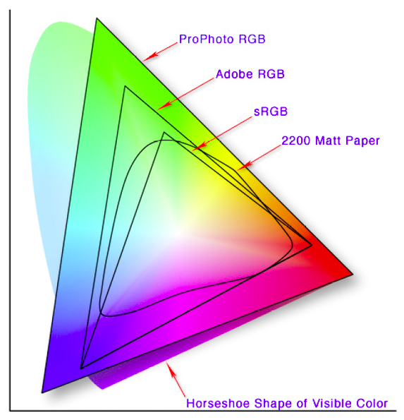
A display of gamuts (ranges) of the various color spaces cover. The “horseshoe” spectrum at the back represents the visible spectrum.
Image created by Jeff Schewe
Colors on the Web
The standardization of color online is no accident. The foundations for a universal, structured, deterministic view of color were laid in 1993 (right as popular culture began embracing the internet) with the creation of the International Color Consortium (ICC). You may have heard of it. That year, eight industry leaders came together to create and foster an “open, vendor-neutral, cross-platform color management system architecture.” Because of the hard work of many people in the mid-to-late nineties, identical images render in a similar fashion across a myriad of platforms.
Take a moment to look at the three columns of images below. The colors should look the same across each of them. If there is a difference, it’s because your browser doesn’t display embedded color profiles correctly. Don’t be alarmed, this isn’t a true problem, because as of this writing, it’s more common for browsers to lack support for embedded color profiles than embrace them. Indeed, only Apple Safari, Google Chrome, and Firefox 3 (with an additional color plugin) support embedded spaces. This means that when we introduce color to our websites (including our online portfolios and galleries) we must take special care to make sure that it is consistent color.
| sRGB | Adobe RGB | ProPhoto RGB |
|---|---|---|
 |
 |
 |
 |
 |
 |
Note: This table reproduced with the explicit permission of diglloyd.com, you can find the original article on his website.
Taking the above into account, images should be saved and shared in the sRGB color space for the greatest degree of interoperability (unless, of course, your audience is aware—or requests that—you provide them with content in another color space). Colors in the sRGB space have an unambiguous definition, so that even without the use of professional color calibration, real-world monitors in normal viewing conditions will generally display colors very close to those specified.
If you’re using the latest version of Firefox, you can make sure that your browser is displaying pictures that make use of embedded color profiles by downloading the Color Management plugin for Firefox.
Now that we understand how embedded-color is used in online images, let’s look at how we can optimize our own images for online display.
256 Colors?
Way back when I was a youngin’, we had 216 colors on our web sites and we enjoyed it. Well, mostly. The number 216 was chosen so that websites could display exactly 6 shades of red, blue, and green (6 x 6 x 6 = 216). This way, computer displays (that only used 256 colors) could display web graphics without using dithering. Unfortunately, this idea has persisted to this day even though computer displays typically show colors using 16-bit or 24-bit color (2^24 is much much greater than 2^8). To exacerbate things even more, only 22 of those 216 colors are now deemed “web safe,” with consistent renderings across 16-bit displays. The bottom line? Using the sRGB color space is your best bet, but color consistency is one thing the W3C cannot standardize.
Taking your Images Online
Images are in a unique position online. Many portable cameras and video recorders will (by default) save files embedded with the sRGB color space. This is a huge advantage, as most of the content these devices generate is destined for use online.
Moreover, if you’re lucky enough to have a post-processing workflow in place, you’ll should make it a point to bring your images into Adobe Photoshop, convert them to sRGB and then perform some any of a number of manipulations so that they look the same as you intended them before chooing “Save for web/devices.” Keep in mind that the “save for web/devices” option in Photoshop will apply the sRGB color space to your your images (where applicable), regardless of the filetype you choose.
If you find that colors are changing depending on the browser or operating system you’re looking at a site with, it’s most likely a color space issue. Perhaps you’ve designed a graphic in one color space, only to find that saving it in a different color space ruins your image? If that’s the case then you should check out this awesome article over at viget that describes how they tackled mysterious color shifts.
Image Types
Even though it’s more-or-less common knowledge, I think it’s important to review what each image type implies about its use.
-
JPG

The JPG compression algorithm can make a good image go bad. But in most cases it’s efficient and the “artifacting” is minimal.
JPGs (Jay-pegs) are the most common type of image presented online. This is because their compression algorithm plays well with typical photographs (not line art or drawings with detail). But do keep in mind that jpegs are compressed as they are saved. This means that opening, saving, and reopening a jpg, even if you do not change the file, will degrade the image each time. This is a less-than-ideal way to work with images, so try and save images as jpgs as infrequently as possible.
JPGs are also commonly used offline, because they support many different kinds of color profiles/spaces. For example, in the print world, high-resolution JPGs in the CMYK color space are sent (as proofs) to printers.
-
GIF
GIFs (jiff) the “graphics interchange format” was introduced by CompuServe in 1987. The format supports things not found in traditional photographs: animations and areas of transparency. The GIF file format does not require a specific color space. Instead, it uses an embedded color palate—containing up to 256 colors.
This is one of a number of shortcomings of the GIF format. GIFs do not support semi-transparent areas. Today, in most cases where GIFs would be favored, they have been discarded for PNGs. The only problem being that Internet Explorer 6 doesn’t support alpha-transparency. Well, not out of the box. You can make it happen with some gratuitous hacking.
-
PNGs
PNG (ping), which stands for “portable network graphic,” were introduced in 1996 but didn’t see widespread adoption until more recently. PNGs support lossless compression (they don’t degrade between saves) and alpha transparency. This means that effects that require opacity-blending, such as drop-shadows, are easily achieved using PNGs. To further illustrate the intended use of PNGs, the format is bound to the sRGB color space. This makes PNGs ideal for sharing graphics over the internet. From vectors to photographs, saving an image as a PNG is generally a safe bet.
The bottom line is to pick the tool that’s best suited to the job. I would recommend saving/previewing an image in the three types above and seeing how the compression algorithms (or lack thereof) affect your image’s size and quality.
With a solid understanding of the state of color online, we can now investigate how these properties translate to the stylesheets that color our websites.
Defining Color through CSS
Defining color in your stylesheet is easy enough. Many designers get the basics in a matter of days. While I won’t go too much detail here, there are many options for introducing color into your web pages using only CSS (Check the CSS resources in this article’s “Resources” section). In today’s browser landscape, site designers can assign colors to:
- Backgrounds
- Text
- Headings
- List Items
- Borders
- Links
- Strong, Em, Quotes
- Text Shadows (on current builds of Webkit and Gecko layout engines)
- etc
Many web designers use hexadecimal notation to assign colors to these elements. These are simple enough. With 256 values of red, green, and blue, one specifies any given primary color by a pair of numbers, 00 – FF. As there are 16 options for each decimal, there are a total of 256^3 = 16,777,216 colors available online (using a pair of numbers to define each of red, green, and blue).
But this only scratches the surface of what CSS allows us to specify. The CSS Working Group has been hard at work defining what’s in store for the next generation of browsers. I’ve poured over the CSS3 Color Module and pulled out the gems. Let’s look at some of the lesser-known options that will soon be available to us.
What’s in the future for Color in CSS
-
New ways to specify color
RGBA Colors
Modern browsers support the rgb(x, y, z) way of notating color. In CSS3, designers can now specify a color’s alpha-transparency. The beauty of this simple change is that it enables a level of presentation that previously required a plethora of unnecessary markup to accomplish. For example:
    { color: rgb(255,0,0) }      /* integer range 0 - 255 */
    { color: rgba(255,0,0,1)     /* the same, with explicit opacity of 1 */
    { color: rgb(100%,0%,0%) }   /* float range 0.0% - 100.0% */
    { color: rgba(100%,0%,0%,1) } /* the same, with explicit opacity of 1 */
There is no hexadecimal notation for these values (obviously).
HSL Colors
As detailed in the W3C’s CSS3 Color Module, colors used in stylesheets can now be specified by use of the Hue, Saturation, Lightness scheme. For example, you can now use colors like so:
      { color: hsl(0, 100%, 50%) }   /* red */
      { color: hsl(120, 100%, 50%) } /* green */
      { color: hsl(120, 100%, 25%) } /* dark green */
      { color: hsl(120, 100%, 75%) } /* light green */
      { color: hsl(120, 75%, 75%) }  /* pastel green, and so on */
As we saw in the first article of this series, picking hues for your web designs is imperative. Because many site’s utilize a variation of a pre-defined palate, the hsl-scheme of defining colors produces much more color consistency—if your website calls for green (hue 120), you can make sure that’s the first number and apply your variations using the last two variables. What more, CSS3 allows for an alpha channel to be applied to HSL colors, via HSLA. The format follow suit with RGBA.
CurrentColor Keyword
Unlike the previous specifications of CSS, which left some ambiguity as to how browsers should render an undefined border-color (they presently take on the “color” of the containing element). No more. CSS3 provides a new keyword, currentColor. In this case, a border can explicitly reference the color of it’s containing element. If the “color” property is set to “currentColor,” it is interpreted as “inherit” at parse time.
Flavor Keyword
The Flavor keyword allows designers to tap into a user’s browser settings and color elements of their websites with the user’s specified accent color. This keyword can be put to great use when styling web applications. It’s an undeniably easy way to make a user feel like your website is presented in a way familiar to them.
:focus {outline: 1px solid flavor} /* puts an outline around the currently focused element that color coordinates with the browser accent color if any */ -
CSS Gradients
While not aprt of the official CSS3 Spec, gradients are slowly making their way into browsers. Prsently, only webkit supports CSS-gradients, though, so you’ll have to checkout these demos in the latest versions of Google Chrome or Apple Safari. The syntax is pretty complicated:
-webkit-gradient(<type>, <point> [, <radius>]?, <point> [, <radius>]? [, <stop>]*)and outputs an image, that you can assign to the following elements:
- background-image
- border-image
- list-style-image
- content property
Be sure to checkout the example and play around. It could come in handy in the (hopefully not-too-distant) future.
-
Color Profile
While not dropped from the current draft, there is no exact specification of the CSS3 Color Profile property. I can only assume that color-profile will allow users to actually specify the color profile used to render any particular image on their website. In this way, a designer can specify: auto, sRGB, or (something akin to) url(“http://example.com/profiles/eg.icm”) and assign this profile to particular images on their site. More information exists at the W3C.
-
Rendering Intent
There isn’t much information available on rendering-intent; suffice it to say that it works to shift the gamma and color values associated with an image to “correct” it’s display. Depending on your needs, this is more-than-likely to be overkill. The proposed values for the property include: auto, perceptual, relative-colorimetric, saturation, absolute-colorimetric, and inherit. Lastly, the ICC helps clarify rendering intent by saying:
In general, actual device color gamuts (the range of all possible colors which can be represented or produced on the device) will not be large enough to reproduce the desired color appearances communicated by the PCS values. Four rendering intents (gamut mapping styles) are defined by the ICC in order to address this problem. Each one represents a different compromise. The colorimetric rendering intents enable within gamut colors to be reproduced accurately (though possibly with compensation for the whiteness of the media) at the expense of out-of-gamut colors. Compensation can be made for chromatic adaptation when the viewing condition assumed is different to the reference viewing environment. The other rendering intents modify the colorimetric values as-needed to account for any differences between devices, media, and viewing conditions.
-
Color Names
While the HTML 4.01 Specification defined sixteen colors web designers could call by name, today’s list is much more broad. As of 2005, all modern browsers support a wide array of color names. Many of these colors received their name from the list of X11 Color names.
Below I’ve included a list of all colors which were given a value in the CSS3 Specification, as seen on wikipedia.org, hidden by default.
HTML name Hex code Red colors IndianRed CD 5C 5C LightCoral F0 80 80 Salmon FA 80 72 DarkSalmon E9 96 7A LightSalmon FF A0 7A Crimson DC 14 3C Red FF 00 00 FireBrick B2 22 22 DarkRed 8B 00 00 Pink colors Pink FF C0 CB LightPink FF B6 C1 HotPink FF 69 B4 DeepPink FF 14 93 MediumVioletRed C7 15 85 PaleVioletRed DB 70 93 Orange colors LightSalmon FF A0 7A Coral FF 7F 50 Tomato FF 63 47 OrangeRed FF 45 00 DarkOrange FF 8C 00 Orange FF A5 00 Yellow colors Gold FF D7 00 Yellow FF FF 00 LightYellow LemonChiffon FF FA CD LightGoldenrodYellow FA FA D2 PapayaWhip FF EF D5 Moccasin FF E4 B5 PeachPuff FF DA B9 PaleGoldenrod EE E8 AA Khaki F0 E6 8C DarkKhaki BD B7 6B Purple colors Lavender E6 E6 FA Thistle D8 BF D8 Plum DD A0 DD Violet EE 82 EE Orchid DA 70 D6 Fuchsia FF 00 FF Magenta FF 00 FF MediumOrchid BA 55 D3 MediumPurple 93 70 DB Amethyst 99 66 CC BlueViolet 8A 2B E2 DarkViolet 94 00 D3 DarkOrchid 99 32 CC DarkMagenta 8B 00 8B Purple 80 00 80 Indigo 4B 00 82 SlateBlue 6A 5A CD DarkSlateBlue 48 3D 8B MediumSlateBlue 7B 68 EE HTML name Hex code Green colors GreenYellow AD FF 2F Chartreuse 7F FF 00 LawnGreen 7C FC 00 Lime 00 FF 00 LimeGreen 32 CD 32 PaleGreen 98 FB 98 LightGreen 90 EE 90 MediumSpringGreen 00 FA 9A SpringGreen 00 FF 7F MediumSeaGreen 3C B3 71 SeaGreen 2E 8B 57 ForestGreen 22 8B 22 Green 00 80 00 DarkGreen 00 64 00 YellowGreen 9A CD 32 OliveDrab 6B 8E 23 Olive 80 80 00 DarkOliveGreen 55 6B 2F MediumAquamarine 66 CD AA DarkSeaGreen 8F BC 8F LightSeaGreen 20 B2 AA DarkCyan 00 8B 8B Teal 00 80 80 Blue colors Aqua 00 FF FF Cyan 00 FF FF LightCyan E0 FF FF PaleTurquoise AF EE EE Aquamarine 7F FF D4 Turquoise 40 E0 D0 MediumTurquoise 48 D1 CC DarkTurquoise 00 CE D1 CadetBlue 5F 9E A0 SteelBlue 46 82 B4 LightSteelBlue B0 C4 DE PowderBlue B0 E0 E6 LightBlue AD D8 E6 SkyBlue 87 CE EB LightSkyBlue 87 CE FA DeepSkyBlue 00 BF FF DodgerBlue 1E 90 FF CornflowerBlue 64 95 ED MediumSlateBlue 7B 68 EE RoyalBlue 41 69 E1 Blue 00 00 FF MediumBlue 00 00 CD DarkBlue 00 00 8B Navy 00 00 80 MidnightBlue 19 19 70 HTML name Hex code Brown colors Cornsilk FF F8 DC BlanchedAlmond FF EB CD Bisque FF E4 C4 NavajoWhite FF DE AD Wheat F5 DE B3 BurlyWood DE B8 87 Tan D2 B4 8C RosyBrown BC 8F 8F SandyBrown F4 A4 60 Goldenrod DA A5 20 DarkGoldenrod B8 86 0B Peru CD 85 3F Chocolate D2 69 1E SaddleBrown 8B 45 13 Sienna A0 52 2D Brown A5 2A 2A Maroon 80 00 00 White colors White FF FF FF Snow FF FA FA Honeydew F0 FF F0 MintCream F5 FF FA Azure F0 FF FF AliceBlue F0 F8 FF GhostWhite F8 F8 FF WhiteSmoke F5 F5 F5 Seashell FF F5 EE Beige F5 F5 DC OldLace FD F5 E6 FloralWhite FF FA F0 Ivory FF FF F0 AntiqueWhite FA EB D7 Linen FA F0 E6 LavenderBlush FF F0 F5 MistyRose FF E4 E1 Grey colors Gainsboro DC DC DC LightGrey D3 D3 D3 Silver C0 C0 C0 DarkGray A9 A9 A9 Gray 80 80 80 DimGray 69 69 69 LightSlateGray 77 88 99 SlateGray 70 80 90 DarkSlateGray 2F 4F 4F Black 00 00 00 -
CSS Variables
Hopefully this feature will see the light of day sooner rather than later. Ideally, you can define colors (or fonts, or any of a number of things) at the top of your style sheet and call upon them later. Voila! An instant way to setup and change the color scheme of your site. It would work as follows:
      @variables { siteFont: #f00; }
      h1 { color: var(siteFont); }
As of this writing, CSS doesn’t support these. Although, there are a number of available workarounds. In the interim, a proposal for CSS variables published that we can only hope is under the consideration of the W3C’s working group.
Last Thoughts
If you’ve made it all the way through, thanks; this was certainly a hard article to write. After the initial outline was finished, I found it very difficult to translate technical information to something that is easily approachable. I know that the goal was certainly ambitious, but the article turned out to not be unbearably long (well, I think so). Going forward, I hope that this page helps new people and serves as a bare-bones reference to others.
In the next part of the series we’ll turn theory into practice and have a bit of fun. Color doesn’t have to be all theory and no practice! Next time, we’ll actually get our hands dirty by choosing a color scheme, strategizing our implementation, and contemplating future maintenance. All of the day-to-day parts picking and implementing color will all be laid bare. See you there!
Resources
- The Mysterious “Save for Web” Color Shift
- A note on color palates on the web
- The International Color Consortium
- ICC.1:2004-10 Specification
- diglloyd: Web Browser Color Display
- W3C’s Color Tips
- Wikipedia on Web Colors
- 70 Expert Ideas For Better CSS Coding
- The Constants Gardener
- CSS Server Side Constants
- Introducing CSS Gradients
- W3C CSS Color Module Level 3